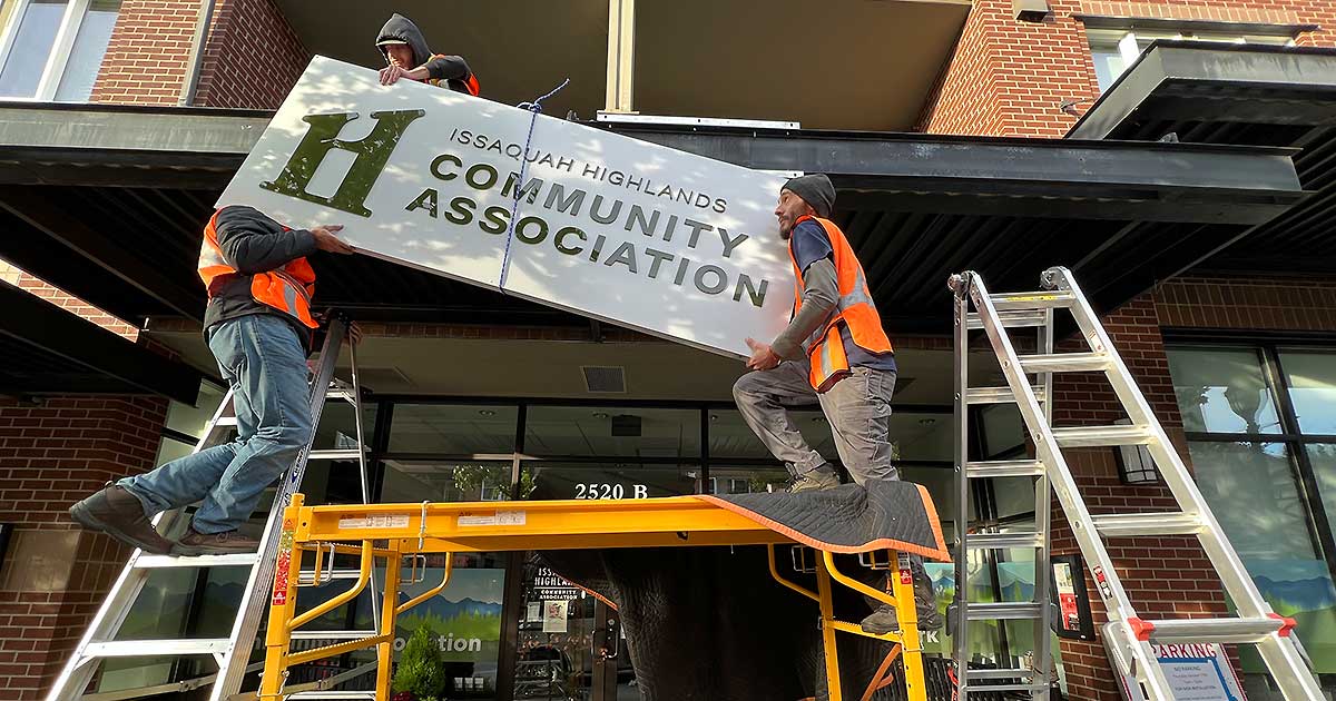
Issaquah Highlands Community Association (IHCA) is introducing a new logo as part of the community’s updated brand identity, which launched in January. Joining Highlands Council, Highlands Fiber Network (HFN) and the Issaquah Highlands Community Fund, the new IHCA logo features the capital “H” with the hidden lowercase “i” inside. (Can you spot the leaf dotting the “i”?)
The longstanding logos that Port Blakely, developer of Issaquah Highlands, created at the neighborhood’s conception, have served the community well—but it was time to refresh. The four community governance organizations have collectively decided to update the community’s logos to express the unity and consistency of the work we do together. Joining the rebranding efforts is a symbol of our commitment to honor the stewardship of this community.
The rollout of the IHCA’s new logo will occur gradually over the next year as changing all signage, decals, and documents to reflect the new brand is a time-consuming process. The IHCA appreciates your patience and understanding.
The logos are changing, but what we do as individual organizations is not. The new brand identity and logos better meet the needs of our growing community as we approach the 25-year anniversary of Issaquah Highlands, which is right around the corner in 2023.
A big thank you to Highlands Council for taking the lead in the rebranding process. Enjoy!
Sarah Hoey is executive director of the IHCA.
